TogoTainer
brand, web and marketing assets design
Brand Design
Transitioning towards eco-friendliness, Togotainer, a prominent to-go container company, is refreshing its brand design and assets to boost visibility and coherence.
Through thorough rebranding, Togotainer underscores its dedication to sustainability, maintaining a distinctive and impactful brand identity. Every aspect, from revamped logos to eco-conscious packaging, is carefully tailored to resonate with environmentally aware consumers, solidifying Togotainer's pioneering role in sustainable food packaging.
Old Brand

The previous Togotainer logo, though functional in its time, lacked the vibrancy needed to embody the company's evolving ethos. Its overly corporate aesthetic failed to convey the eco-friendly, down-to-earth nature and adaptable features that define Togotainer's essence.
Therefore, a rebranding was imperative to accurately reflect the company's direction and resonate more effectively with its audience.
Inspirations




Logo Design

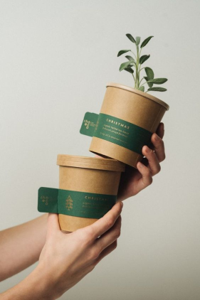
The kraft bowl
Leading the eco-friendly food container revolution.
Leading the eco-friendly food container revolution.


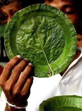
The green leaf
Nature's emblem of freshness and vitality.
Nature's emblem of freshness and vitality.


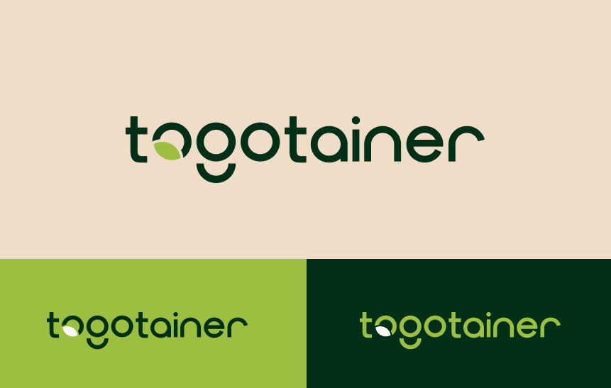
The logo symbolize the fusion of eco-friendly packaging with fresh, natural ingredients, representing sustainability and health-consciousness

Brand Colors
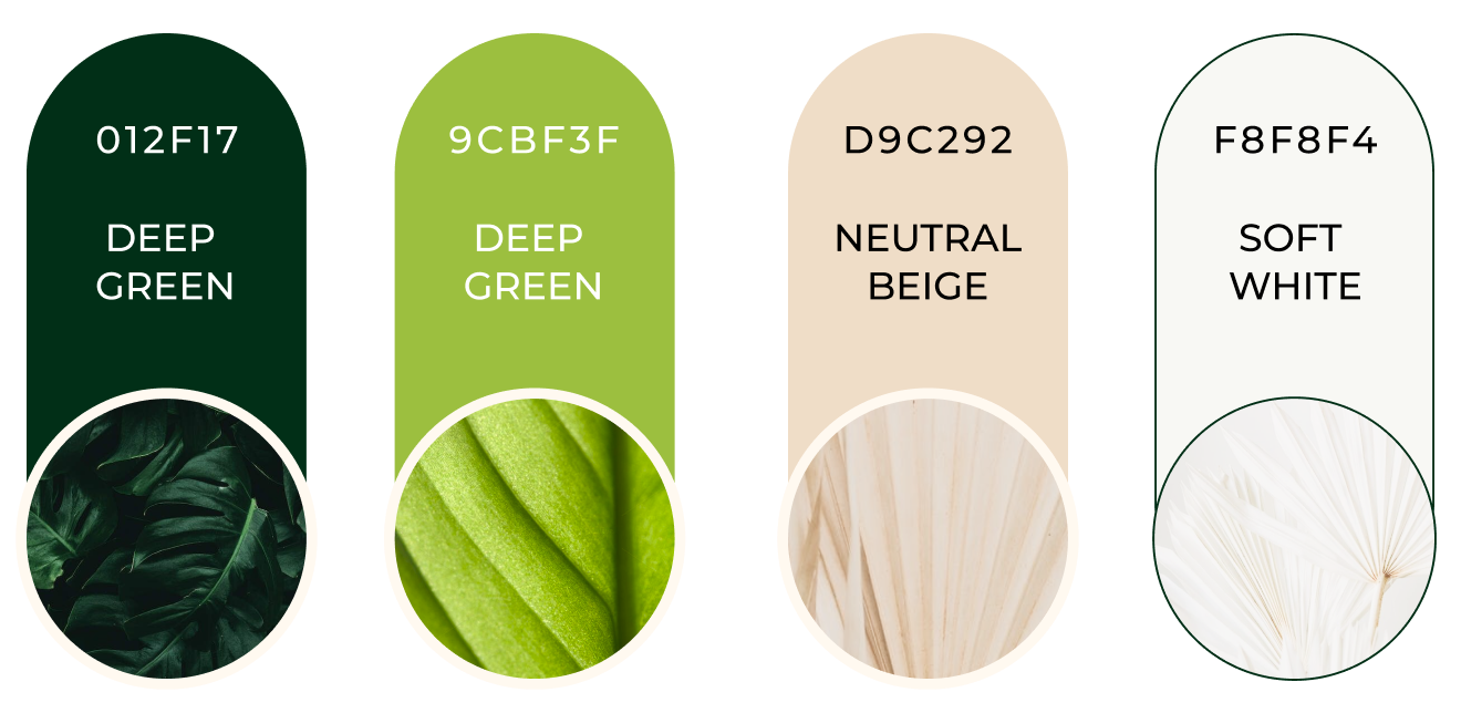
The color palette for TogoTainer is thoughtfully crafted to represent the brand’s sustainable and innovative approach to eco-friendly packaging.
The deep green reflects the brand’s strong connection to nature and environmental responsibility. Complementing it, the fresh green evokes a sense of growth, renewal, and sustainability, reinforcing the brand’s commitment to eco-conscious solutions. The neutral beige adds a touch of warmth and timelessness, while the soft white provides clarity and balance, ensuring a clean and approachable aesthetic.
Together, these colors create a cohesive, professional, and eco-friendly visual identity that aligns perfectly with TogoTainer’s mission to lead the way in sustainable takeout packaging.
Typography
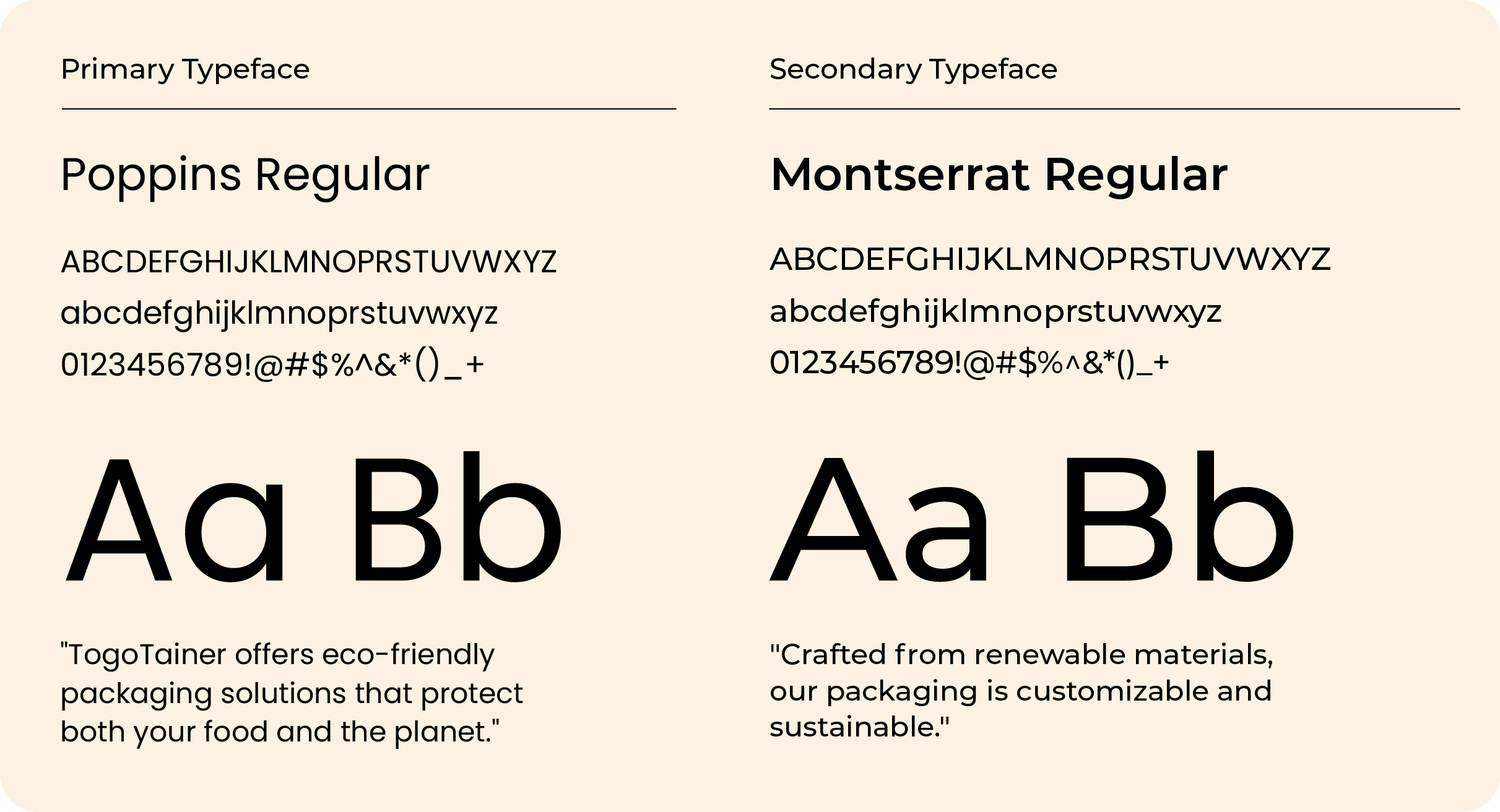
The chosen fonts for TogoTainer, Poppins for headers and Montserrat for body text, create a modern and cohesive visual identity that aligns with the brand's focus on innovation and sustainability. Both fonts are part of the sans-serif family, offering a clean and contemporary look while maintaining functionality.
Poppins, with its bold, geometric shapes, adds a playful yet professional touch to headers, making key information stand out. Montserrat complements it with its versatile and structured design, ensuring excellent readability for body text.
The subtle differences between the two fonts—Poppins's rounded edges versus Montserrat's narrower letterforms—create enough contrast to establish a clear visual hierarchy. This pairing reflects TogoTainer's commitment to quality, clarity, and forward-thinking solutions.
Brand Assets
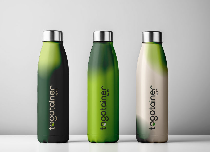
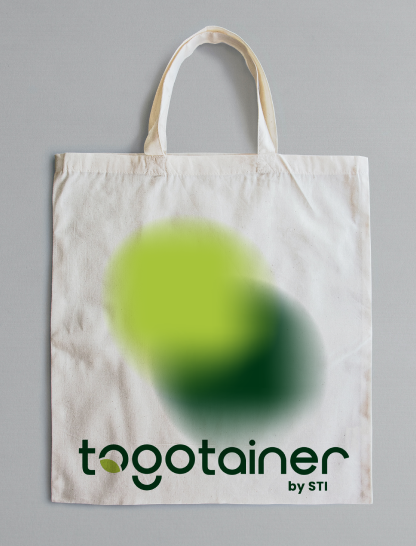
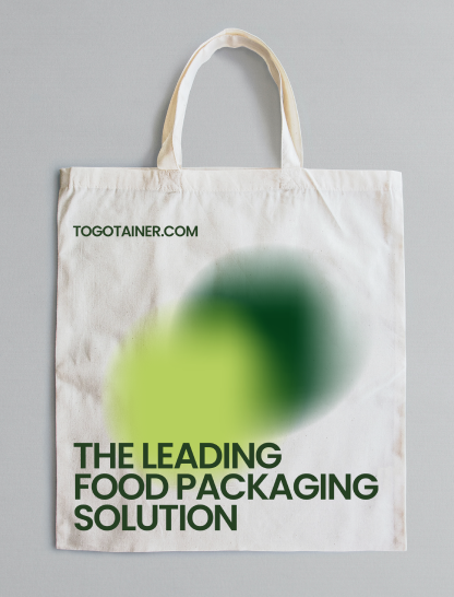
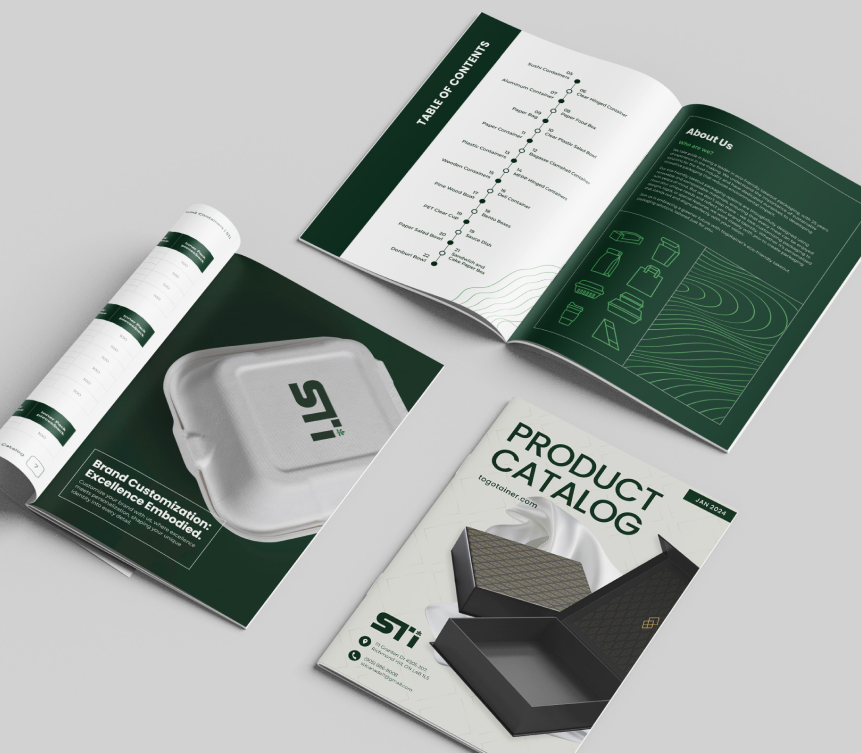
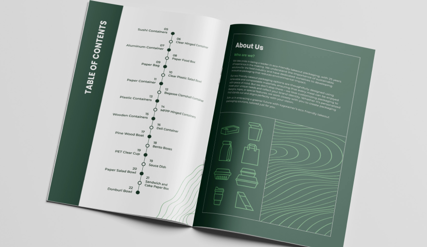
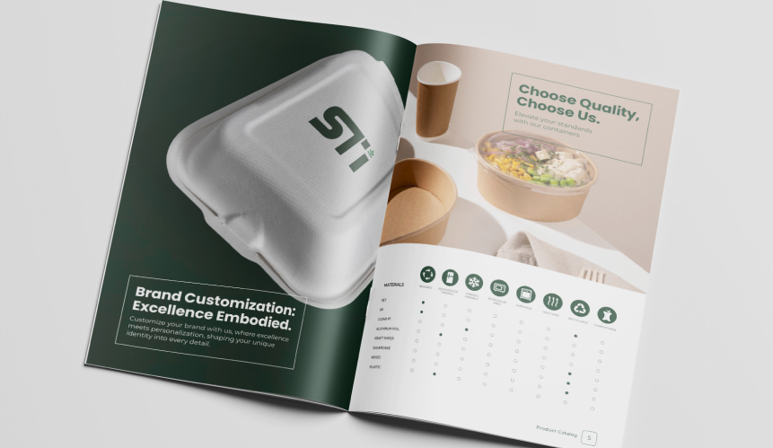
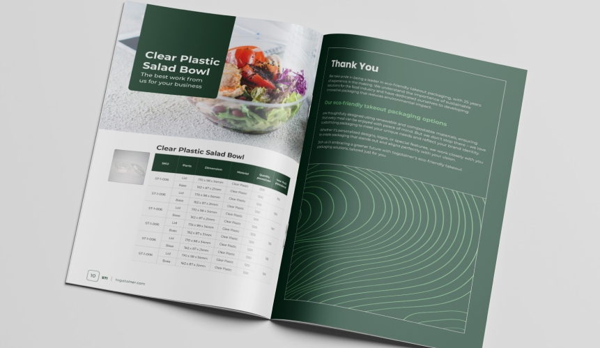
Ensuring consistent branding for Togotainer across print and digital assets is crucial for reinforcing its identity and building trust with customers. From brochures to online platforms, uniformity in logo usage, color schemes, and messaging creates a seamless brand experience, fostering recognition and loyalty across all channels.
Packages and Merchandises

Brand Colors
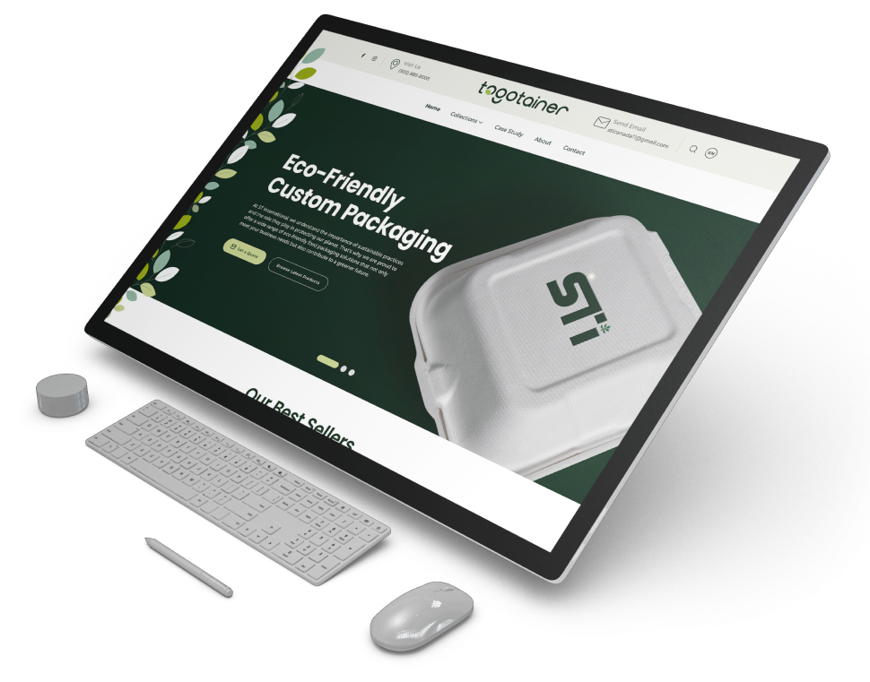
Web Design
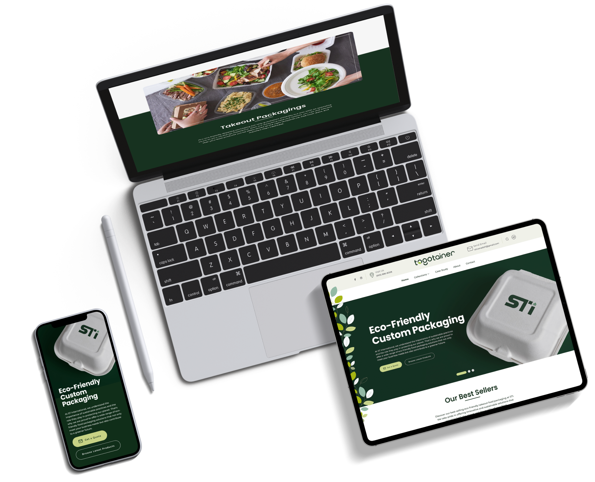
Transitioning towards eco-friendliness, Togotainer, a prominent to-go container company, is refreshing its brand design and assets to boost visibility and coherence.
Through thorough rebranding, Togotainer underscores its dedication to sustainability, maintaining a distinctive and impactful brand identity. Every aspect, from revamped logos to eco-conscious packaging, is carefully tailored to resonate with environmentally aware consumers, solidifying Togotainer's pioneering role in sustainable food packaging.
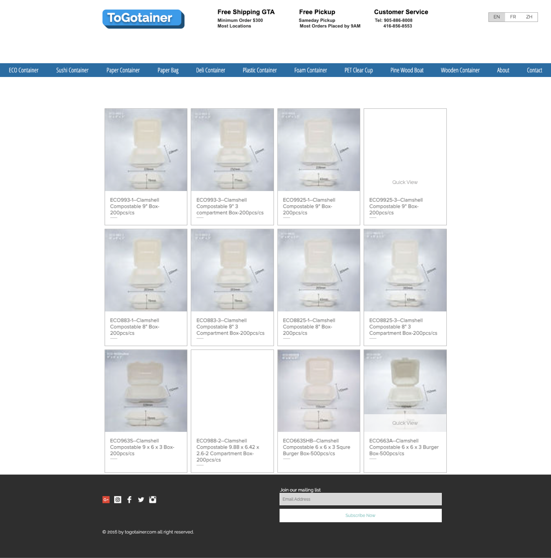
Old Website
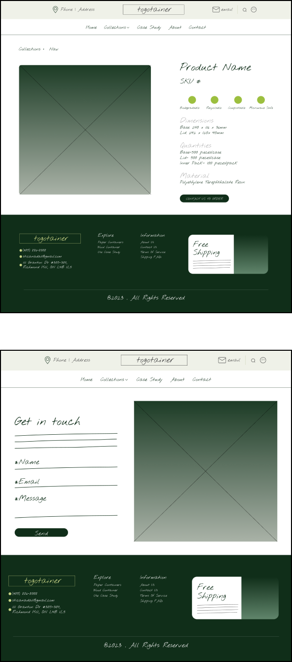
Wireframe
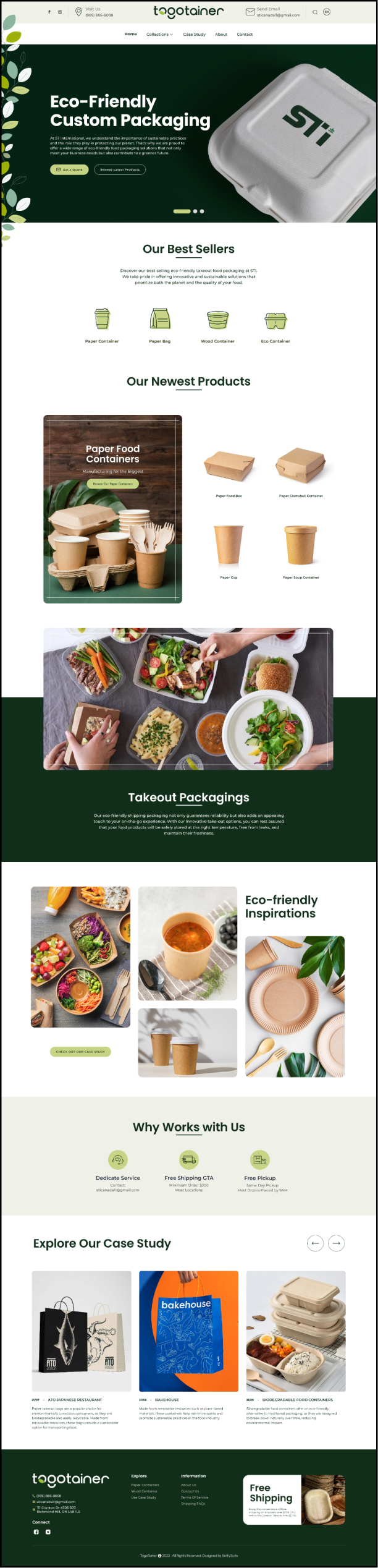
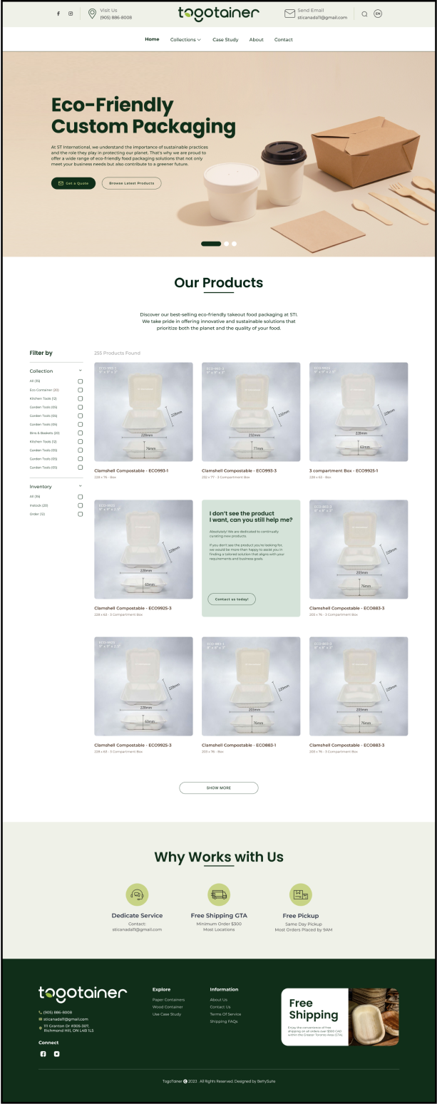
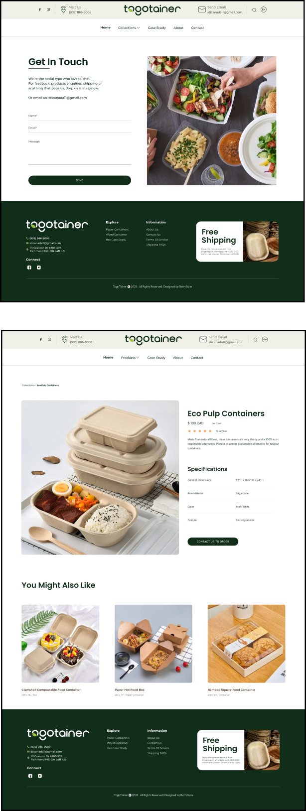
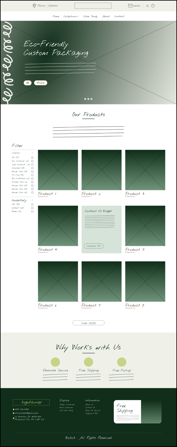
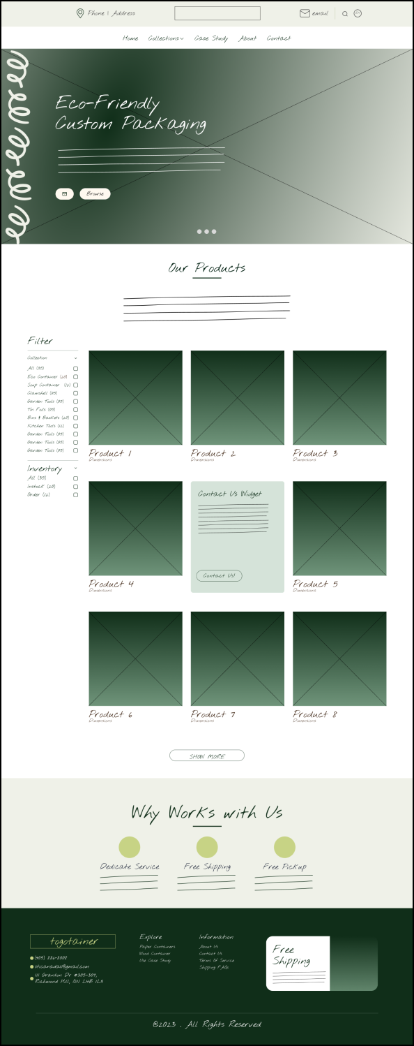
In this web design project, the wireframing process commenced post-branding, with a focus on integrating the project's goals into the visual elements while adhering to the new brand guidelines.
Design
By maintaining a cohesive brand presence across various touchpoints, Togotainer can effectively communicate its values and offerings to its target audience. This holistic approach not only strengthens brand recognition but also enhances customer engagement and fosters long-term relationships.